Table of Contents
Executive Summary
National Summary
Pending Sales and Inventory
Home Values and Sale Prices
Search Behavior
Home Characteristics
Rental Prices
Executive Summary
Are people fleeing the cities for greener suburban pastures? Some faint signals may have emerged in certain places, but by and large, the data show that suburban housing markets have not strengthened at a disproportionately rapid pace compared to urban markets. Both region types appear to be hot sellers' markets right now – while many suburban areas have seen strong improvement in housing activity in recent months, so, too, have many urban areas.
Zillow's Economic Research team analyzed a variety of Zillow data points in order to illustrate this trend. Data related to for-sale listings are generally the best indicator of real-time housing market activity, and in all but a few cases, suburban markets and urban markets have seen similar changes in activity in recent months: about the same share of homes selling above their list price, similar changes in the typical time homes spend on the market before an offer is accepted, and recent improvements in newly pending sales have been about the same across each region type.
Other indicators also help drive home this conclusion. Changes in annual home value growth rates from just before the pandemic to now have been about the same for urban and suburban markets. In some regions where there is a divergence, the discrepancy can be explained by trends that were unfolding before the pandemic. Page view data also show that suburban home listings have not grown in relative popularity in the past few months. For-sale suburban homes attract more than three times as much of Zillow's traffic as urban listings do, but that was the case last year as well. Interest in detached single-family homes (or similar) has not seen a marked increase in the past year, either.
Earlier differences in sale prices may be the strongest signal of potentially diverging market trends in suburban areas. Median sale price growth has slowed across the board from February to June, and it has decelerated six percentage points more in urban areas than in the suburbs. The urban deceleration in prices was primarily a coastal phenomenon that tracks with a lower pace of pending sales and listing activity generally, especially in the urban Northeast. However, these fluctuations must be interpreted within the context of underlying home values. Median sale price changes can be caused by changes in the composition of homes being sold rather than reflecting true value changes, and sale prices can fluctuate drastically during periods of low transaction volume like we saw this spring. Finally, because our sale price data takes longer to tabulate, this observed difference reflects evidence from earlier in the pandemic, with May listings and pendings showing up in June closings. In the case of listings, we saw that earlier divergences later converged as the summer progressed, and that may occur as well with sale prices as more recent data become available.
Rent prices have seemed more affected by shifting trends during the pandemic. Rents in urban ZIP codes fell more relative to their pre-pandemic trend than in suburban areas, supporting the theory that urban ZIPs were disproportionately affected in the rental market.
While the national trend shows commonality among cities and the suburbs, there are regional differences that make this story more complicated. For example, suburban homes are spending less time on the market than urban homes in the South, but the opposite is the case in the Northeast. Evidence suggests that some of these regional discrepancies might be attributed to supply-side constraints rather than any marked shifts in homebuyer demand.
Metro-level discrepancies exist as well, especially in San Francisco and New York, showing that not all urban cores are keeping pace with hot suburban markets. In Manhattan, home values have dropped 4.2% since last year and homes are staying on the market two months longer than a year ago, According to StreetEasy's July Market Report. In San Francisco, prices have fallen 4.9% year over year and inventory has risen 96% with a flood of new listings. This divergence of active inventory is not evident in cities like Miami, Los Angeles, Washington, D.C., and Seattle.
National Summary
Pending Sales and Inventory:
- Pending sales trends are relatively even across urban classifications nationally, with some regional exceptions.
- Both urban homes and suburban homes are selling more quickly now than they were in February, and the percent change in time on market has been nearly equal for both classifications.
- The share of homes selling above their list price in suburban areas vs. urban areas exhibit the same trend nationally.
- Price cuts are now less common in both suburban and urban areas, with the suburbs seeing a slightly sharper reduction.
- New supply is bouncing back quicker in urban areas, helping to prop up inventory overall. The suburbs displaying persistent sales despite more-limited supply could suggest hotter market conditions. But this is not translating to any change in list prices, which we would expect to climb with strong demand and relatively constrained supply.
- New listings in urban areas don't necessarily imply an emptying of cities. With pending sales and days on market moving similarly between classifications, evidence does not suggest that a glut of new urban inventory is empty, void of demand. Especially as total inventory shrinks drastically in urban areas.
Home Values and Sale Prices:
- Home value growth in urban ZIP codes and in suburban ZIP codes has accelerated at about the same pace since the pandemic started.
- In June, the annual pace of home value growth was 4.3% in urban areas and 4.1% in suburban areas. That pace in urban ZIPs was 0.5 percentage points higher in June than it was in February. In suburban ZIPs, the difference was 0.6 percentage points.
- This is not the case across all metro areas. In some regions where there is a divergence in this metric, much of the discrepancy can be explained by trends that were unfolding before the pandemic
- Pre-coronavirus, the suburban median sale price was up 6.4% year-over-year and urban median sale price was up 9.3% year-over-year. As of the end of June, price growth had fallen to 3.3% and 0%, respectively.
- Sale prices in both regions are starting to show signs of recovery from early-June lows, and if sale prices follow the trend of list prices as transaction volume picks up again, median sale prices would likely re-converge.
- The differences between trends in sale prices and home values can be attributed to a combination of timing and composition effects.
Search Behavior:
- Suburban home listings are not seeing any more attention on Zillow than they were last year, relative to urban or rural listings. Suburban homes made up 62.2% of all Zillow page views of for-sale listings in June 2020, down just slightly from 62.6% in June 2019. Urban and rural page views each climbed 0.2 percentage points from last year.
- Overall traffic to for-sale listings has surged recently, rising 42% year over year in June.
- Listings in the suburbs still attract more than three times as much of Zillow's traffic as urban listings do, but their overall share has held steady, meaning the vast majority of growth in traffic was growth in suburban traffic. In fact, the growth in suburban traffic accounted for 61% of this year's traffic growth.
Home Characteristics:
- A comparison of single-family homes and condos suggests there is no clear sign of a boom for the detached homes that are often synonymous with the suburbs.
- Single-family home values are growing slightly faster (up 4.4% YoY) than condo values (up 3.1% YoY).
- But, changes in annual home value growth rates from pre-COVID to now have been about the same for single-family homes and condos. So single-family homes are appreciating faster now, but they were already doing so earlier this year.
- Meanwhile, the share of page views on single family detached homes actually shrank, from 82.7 last June to 81.1% this June.
- There also is limited evidence that shoppers are searching for larger homes this year. Overall, distribution is almost indistinguishable from last year, with a minor decline for homes between 1,000 and 3,500 square feet and minor increases for homes smaller than 1,000 square feet and larger than 3,500 square feet.
- However, search for expensive homes is up relative to last year. Especially homes listed for more than $1 million.
- Views on new construction homes, typically concentrated in suburban areas, have greatly increased — up 83% YoY in June and 72% YoY in May, compared to only 15% YoY in February. However, new construction sales remain a relatively small fraction of overall home sales.
Rental Prices:
- Rent growth is slowing faster in urban areas. The typical urban ZIP code has seen a decrease in YoY rent price appreciation of 2 percentage points from February to June, while the typical suburban ZIP code has only fallen 1.4 percentage points. percentage points.
- Both urban and suburban rents were on a mild upswing before the crisis, supporting the idea that the pandemic has contributed to declining rents nationally. Furthermore, urban rent prices fell more relative to their pre-pandemic trend than suburban areas, supporting the theory urban ZIPs may have been disproportionately affected.
See individual sections below for more detailed information, regional variation, and corresponding charts.
Pending Sales and Inventory
Pending sales trends are relatively even across urban classifications nationally, with some regional exceptions. Both urban homes and suburban homes are selling more quickly now than they were in February, and the share of homes selling above their list price exhibit the same trend nationally.
Pending sales trends are relatively even across urban classifications, with the exception of the Northeast. States in the Northeast show new pending listings volume in urban ZIP Codes re-accelerating more slowly than in the suburbs. 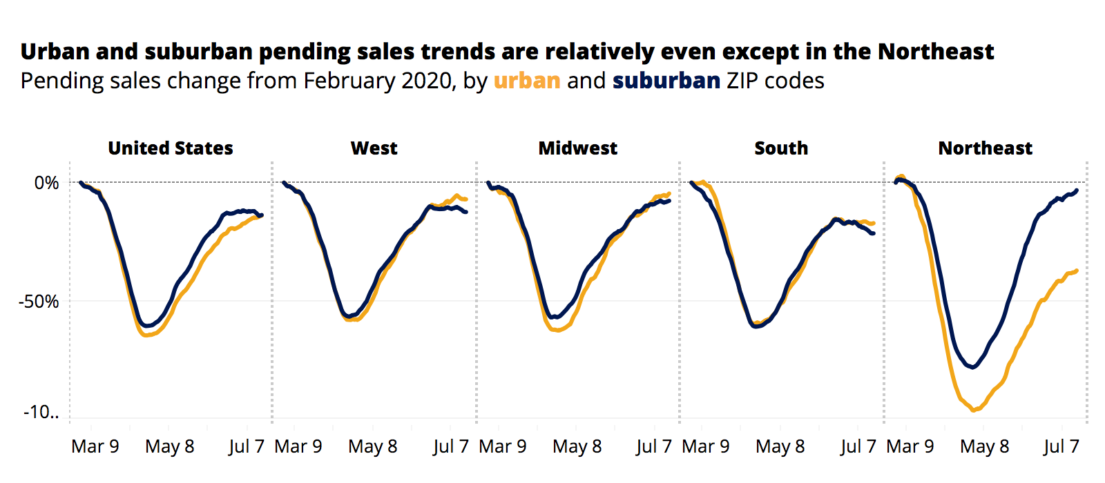 This likely comes from larger declines in overall inventory. Relative to other regions, the Northeast added much less urban inventory early into the pandemic, leading to fewer possible sales later. Supply, not demand is likely the primary driver of tepid reacceleration in the Northeast's pending listings volume, and is also evident in sales velocity.
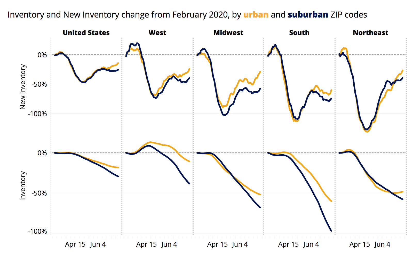
Urban areas have generally bounced back more on new supply and have less limited supply, and this imbalance may suggest that suburban markets could be considered hotter in some areas of the country due to sales keeping up despite limited supply. But this is not translating to any change in list prices.
When comparing the principal city to its surrounding suburbs, the San Francisco metro area does break the mold. Higher levels of inventory, up 96% YoY following a flood of new listings during the pandemic, are sitting on the market in the city proper, a significantly larger jump than the surrounding suburbs. Whereas in similar cities like Los Angeles, Miami, Boston, Seattle, and Washington, D.C., declining or flat inventory is a consistent trend within and outside the city limits. Relatively higher inventory has different causes by city, and is not clearly attributable to either supply or demand. In San Francisco, though, the softening is clear as sellers inundate the market and buyers have not changed their pace to match — newly pending sales in the city are up only 1.7% YoY.
 Nationally, both urban and suburban areas are seeing homes sell more quickly than they were in February. There was a dip at the beginning of the crisis as people rushed to complete shopping. The time on market rose in both region types through the spring, peaking in mid-May before falling mostly in tandem, to faster than the February trend. Suburban time-on-market has dipped slightly lower than urban time-on-market as of July.
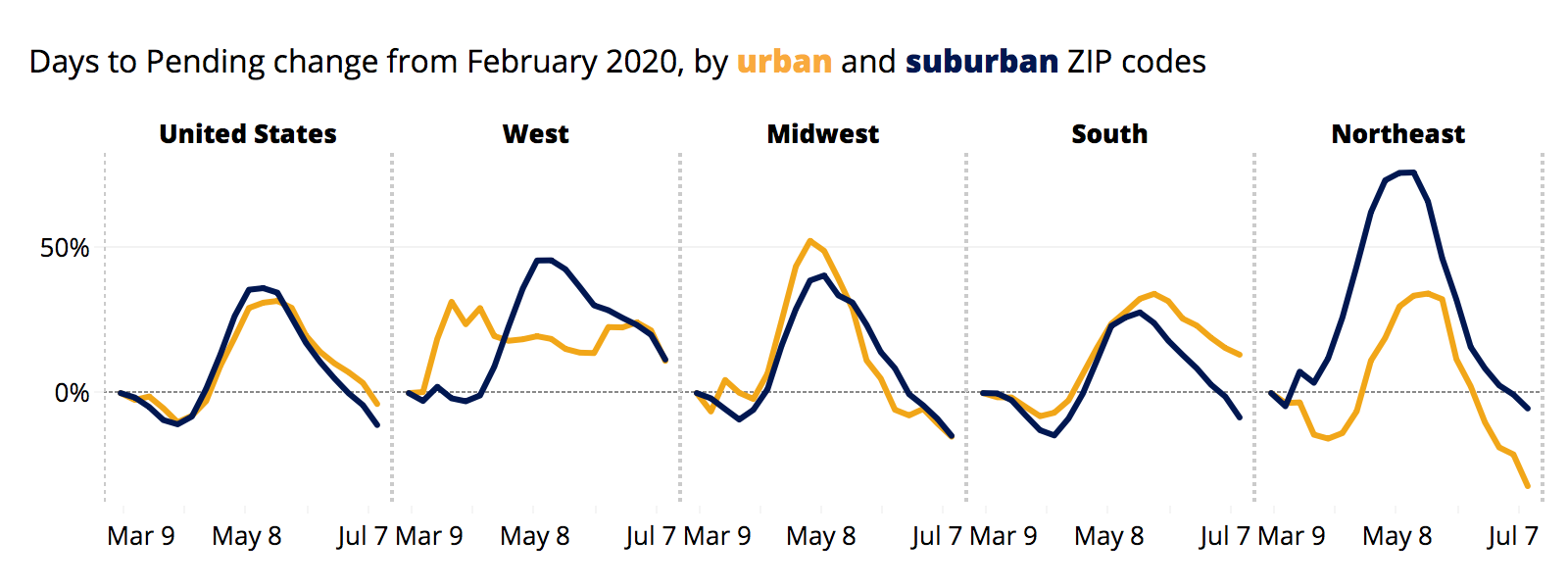
The differences in time on market are driven primarily by the South (the nation's largest region, making up 41% of national new pendings), with time on market relative to last year actually increasing since February in urban areas while declining in the suburbs. Counterintuitively at first, the Northeast region (and even more specifically the Mid-Atlantic Northeast (NY,NJ,PA)) showed the pace of urban sales accelerating since before the pandemic, while suburban sales are on a flat pace with February. This aligns with the supply-side shortages in the urban Northeast, where new inventory has been slower to come online, but existing demand is keeping a low volume of sales still moving quickly.
The share of sales above the list price in suburban areas vs. urban areas exhibit the same trend nationally. Currently down by the same amount compared to their February YoY. By this metric, urban areas look marginally hotter in the Northeast and Midwest, much cooler in the West (especially Mountain division (MT, ID, WY, NV, UT, CO, AZ, NM)). 
Price cuts have moved evenly through the crisis. Most areas have seen price cuts decelerate relative to February, and slightly more so in the suburbs. Differences may not be economically significant. A difference in the share of price cuts — about a percentage point — has gradually closed nationally, driven mainly by trends in the South, with all areas trending back to few price cuts.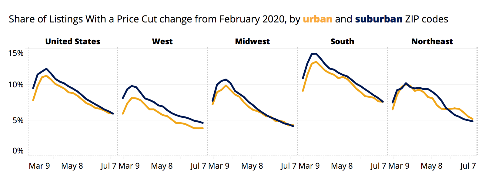 Note the methodology differs greatly from our published price cut metric. The official metric published captures price cut events within a period. This captures the share of listings that had experienced a price cut as of their last active day, and will lag more and trend higher.
Home Values and Sale Prices
Compared to before coronavirus, home value growth since the pandemic started is accelerating slightly less in urban ZIP codes than suburban. In June, home values in suburban ZIPs were growing 0.6 percentage points faster YoY than they were in February, while in urban areas June growth was mildly less pronounced; 0.5 percentage point faster than pre-Covid growth.
Looking at only June, YoY home value growth in June was 4.3% in urban areas and 4.1% in suburban areas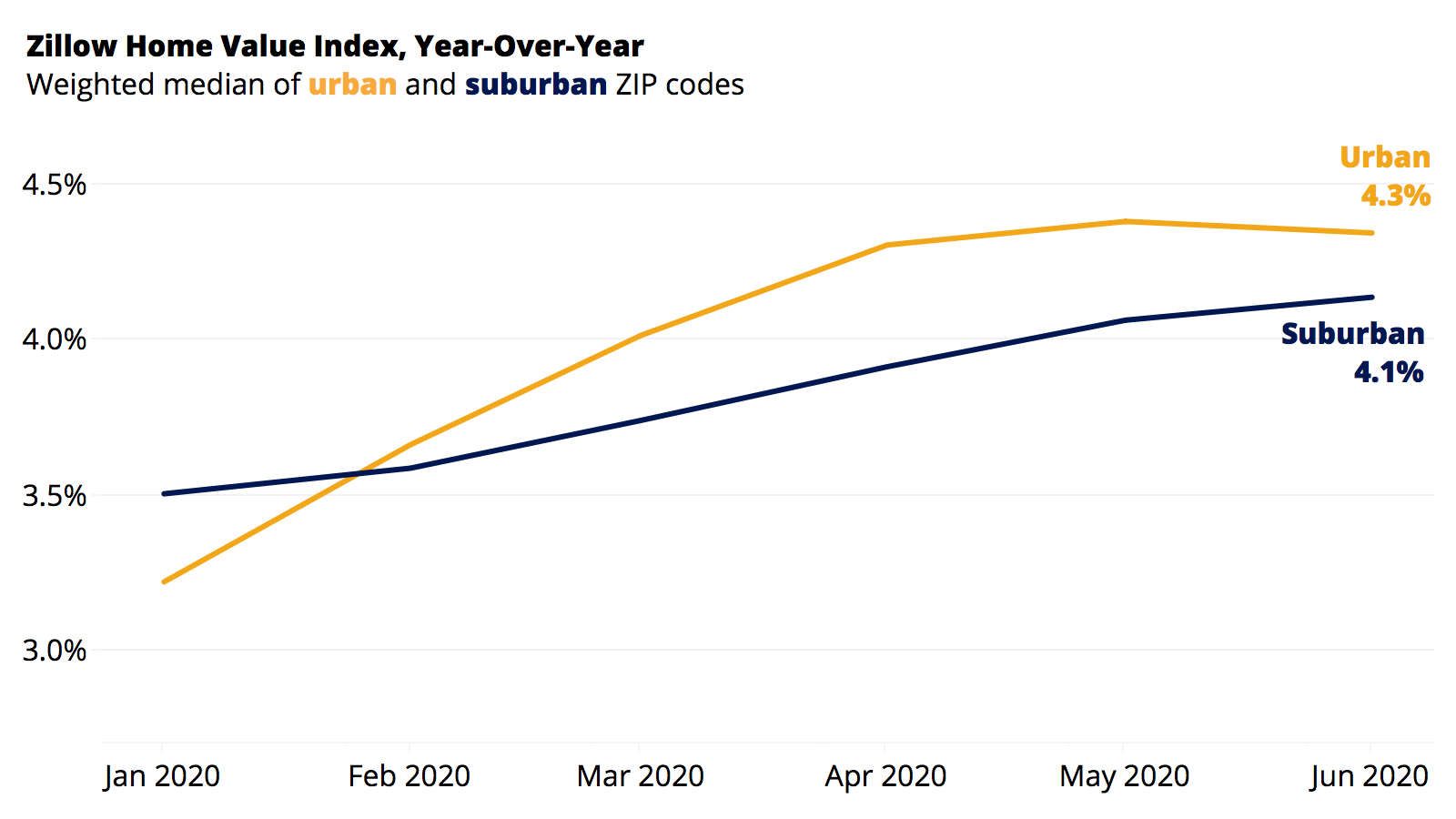
However, this is not a consistent story across all major metropolitan areas. And in some places where this trend holds, this relatively quicker suburban growth was already happening before the pandemic.
Some regions saw stronger evidence for a suburban-urban diverging trend than others. For example, in the New York City metro, home values in urban ZIP codes were decelerating in June relative to pre-COVID trends ( -0.2 pp) while suburban ZIP codes were accelerating (0.2 pp). The same trend holds in Boston with urban home values down 0.5 percentage points and suburban homes values up 1.3 percentage points. However, this deceleration was already a trend (comparing February YoY to January YoY) in the Northeast Region overall, and the New York City metro.
Conversely, the Chicago metro area experienced the exact opposite trend with growth, decelerating in suburban areas while urban areas accelerated. And areas like Philadelphia and Miami saw accelerated growth in both regions, but more so in urban ZIP Codes.
ZHVI Acceleration, Current Change Rate Minus Pre-Pandemic Rate
| Region | Region Type | Suburban | Urban |
|---|---|---|---|
| National | National | 0.6% | 0.5% |
| Midwest Region | Census Region | 0.2% | 0.3% |
| Northeast Region | Census Region | 0.4% | -0.1% |
| South Region | Census Region | 0.7% | 0.7% |
| West Region | Census Region | 0.9% | 0.8% |
| New York-Newark-Jersey City | MSA | 0.2% | -0.2% |
| Los Angeles-Long Beach-Anaheim | MSA | 0.8% | 0.7% |
| Chicago-Naperville-Elgin | MSA | -0.4% | 0.2% |
| Dallas-Fort Worth-Arlington | MSA | 0.9% | 0.6% |
| Philadelphia-Camden-Wilmington | MSA | 0.4% | 0.7% |
| Houston-The Woodlands-Sugar Land | MSA | 1.0% | 0.6% |
| Washington-Arlington-Alexandria | MSA | 0.6% | -0.5% |
| Miami-Fort Lauderdale-West Palm Beach | MSA | 0.8% | 1.2% |
| Atlanta-Sandy Springs-Roswell | MSA | 0.0% | -0.3% |
| Boston-Cambridge-Newton | MSA | 1.3% | -0.5% |
| San Francisco-Oakland-Hayward | MSA | -0.2% | -1.3% |
| Detroit-Warren-Dearborn | MSA | 0.2% | -0.6% |
| Riverside-San Bernardino-Ontario | MSA | 0.6% | 0.4% |
| Phoenix-Mesa-Scottsdale | MSA | 2.4% | 2.6% |
| Seattle-Tacoma-Bellevue | MSA | 2.8% | 3.8% |
| Minneapolis-St. Paul-Bloomington | MSA | 0.9% | 1.1% |
| San Diego-Carlsbad | MSA | 0.2% | 0.3% |
| St. Louis | MSA | 0.3% | 2.3% |
| Tampa-St. Petersburg-Clearwater | MSA | 1.8% | 1.9% |
| Baltimore-Columbia-Towson | MSA | 0.4% | 0.8% |
| Denver-Aurora-Lakewood | MSA | 0.7% | 1.5% |
| Pittsburgh | MSA | -0.4% | -1.0% |
| Portland-Vancouver-Hillsboro | MSA | 1.7% | 2.6% |
| Charlotte-Concord-Gastonia | MSA | 1.5% | 0.9% |
| Sacramento–Roseville–Arden-Arcade | MSA | -0.5% | -0.4% |
| San Antonio-New Braunfels | MSA | -0.5% | -1.6% |
| Orlando-Kissimmee-Sanford | MSA | 1.6% | 1.1% |
| Cincinnati | MSA | 1.7% | 1.9% |
| Cleveland-Elyria | MSA | 0.7% | 1.7% |
| Kansas City | MSA | 2.0% | 2.4% |
Looking solely at this June, YoY home value growth is higher in the suburban New York City metro (1.4% YoY) than in urban New York City metro (0.4% YoY). Same is true for Houston, Atlanta, Washington, Chicago, and Boston. Again only considering June's growth rate, YoY home value growth is lower in the suburban Los Angeles metro (3.8% YoY) than in urban Los Angeles metro (5.1% YoY). Same is true for Dallas, Philadelphia, Miami, and the U.S. overall.
June YoY ZHVI Change
| Region | Region Type | Suburban | Urban |
|---|---|---|---|
| National | National | 4.1% | 4.3% |
| Midwest Region | Census Region | 4.2% | 4.9% |
| Northeast Region | Census Region | 3.2% | 2.5% |
| South Region | Census Region | 4.2% | 4.4% |
| West Region | Census Region | 4.7% | 4.8% |
| New York-Newark-Jersey City | MSA | 1.4% | 0.4% |
| Los Angeles-Long Beach-Anaheim | MSA | 3.8% | 5.1% |
| Chicago-Naperville-Elgin | MSA | 0.7% | -0.3% |
| Dallas-Fort Worth-Arlington | MSA | 2.9% | 3.7% |
| Philadelphia-Camden-Wilmington | MSA | 3.2% | 5.9% |
| Houston-The Woodlands-Sugar Land | MSA | 3.1% | 1.5% |
| Washington-Arlington-Alexandria | MSA | 3.6% | 3.2% |
| Miami-Fort Lauderdale-West Palm Beach | MSA | 3.5% | 3.7% |
| Atlanta-Sandy Springs-Roswell | MSA | 5.1% | 1.9% |
| Boston-Cambridge-Newton | MSA | 4.2% | 1.7% |
| San Francisco-Oakland-Hayward | MSA | 0.5% | 2.1% |
| Detroit-Warren-Dearborn | MSA | 3.5% | 4.9% |
| Riverside-San Bernardino-Ontario | MSA | 4.0% | 5.1% |
| Phoenix-Mesa-Scottsdale | MSA | 9.2% | 11.1% |
| Seattle-Tacoma-Bellevue | MSA | 7.9% | 5.0% |
| Minneapolis-St. Paul-Bloomington | MSA | 4.5% | 4.1% |
| San Diego-Carlsbad | MSA | 5.2% | 5.4% |
| St. Louis | MSA | 3.2% | 6.4% |
| Tampa-St. Petersburg-Clearwater | MSA | 6.2% | 7.5% |
| Baltimore-Columbia-Towson | MSA | 1.6% | 0.8% |
| Denver-Aurora-Lakewood | MSA | 3.5% | 2.9% |
| Pittsburgh | MSA | 3.5% | 2.6% |
| Portland-Vancouver-Hillsboro | MSA | 3.9% | 2.7% |
| Charlotte-Concord-Gastonia | MSA | 6.5% | 7.4% |
| Sacramento–Roseville–Arden-Arcade | MSA | 4.1% | 5.8% |
| San Antonio-New Braunfels | MSA | 2.5% | 1.9% |
| Orlando-Kissimmee-Sanford | MSA | 5.2% | 5.5% |
| Cincinnati | MSA | 5.4% | 9.9% |
| Cleveland-Elyria | MSA | 5.1% | 7.7% |
| Kansas City | MSA | 4.6% | 5.6% |
Sale prices nationally decelerated 6 percentage points more in urban areas than in the suburbs. Pre-coronavirus, the suburban median sale price was up 6.4% year over year and urban median sale price was up 9.3% year over year. By the end of June, that price growth had fallen to 3.3% and 0%, respectively. Across the entire country median sale price growth has slowed to roughly 2% year over year.
Both urban and suburban areas are starting to show signs of recovery from early-June lows and should converge if they follow the trend of list prices as sales volume picks up again.
The urban deceleration in prices was primarily a coastal phenomenon that tracks with the lower pace of pendings and listing activity generally. That's especially true in the urban Northeast, where the suburbs were accelerating YoY relative to before the pandemic by 1.8 percentage points and urban areas decelerating 8.1 percentage points (though still up 4.7% YoY). Prices in the Midwest showed no divergence between the city and the suburbs in late June.
These fluctuations must be understood within the context of underlying home values, which have seen less movement. Median sale prices can capture changes in the composition of homes currently being sold without necessarily pointing to true value changes, and median sale prices can fluctuate more dramatically during periods of low transaction volume. Also, if the larger slowdown in urban sale prices were the product of urban homes suddenly selling at a discount we’d likely see more price cuts in urban areas, which we’re not. Finally, because sales data is more lagged, this may reflect divergences from earlier in the pandemic, with May listings and pendings showing up in June closings. But, in the case of listing trends, earlier divergences later converged as the summer progressed.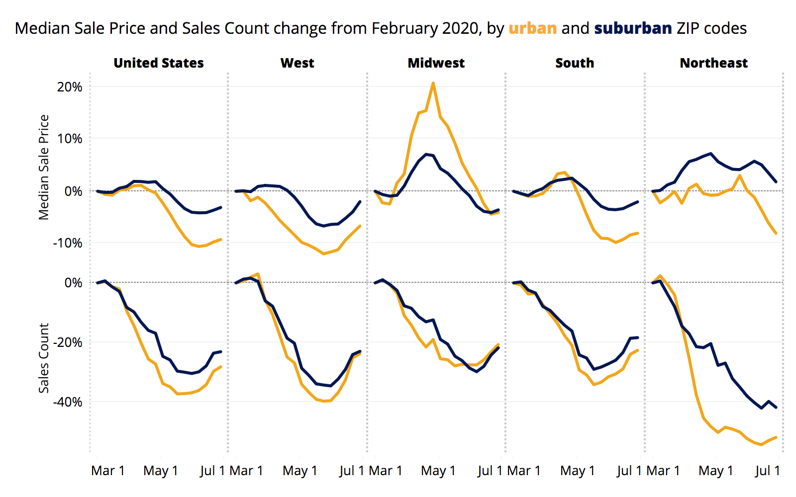
Search Behavior
Suburban home listings are not currently getting any more attention on Zillow than last year, relative to urban or rural listings. The share of Zillow for-sale listings page views in June in suburban areas fell slightly from 62.6% in 2019 to 62.2% in 2020. Urban and rural page views each climbed 0.2 percentage points since last year.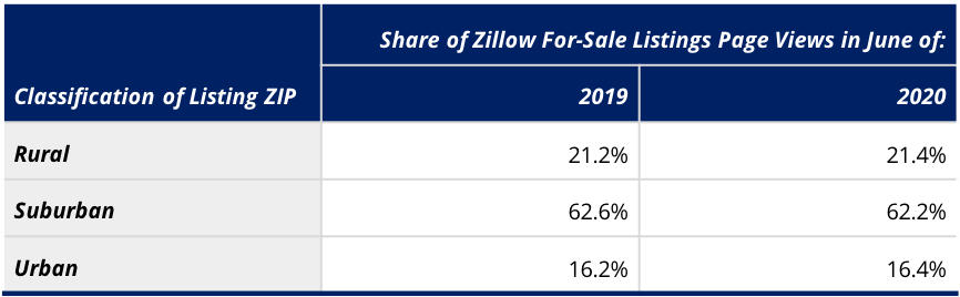
Given how much overall traffic has surged upward, however, (about 42% YoY in June) really every type of listing saw huge gains in traffic. So put differently, the suburbs still attract more than three times as much of Zillow's traffic as urban listings do. And because they kept their overall share nearly steady, it means the vast majority of growth in traffic was growth in suburban traffic. In fact, the growth in suburban traffic accounted for 61% of this year's traffic growth.
Home Characteristics

Nationally, home values for detached single family homes — often associated with the suburbs — do not seem to be booming in value relative to condos. In fact, we find no difference between condos and single family homes in home value growth trends relative to before the pandemic. However, if we just look at YoY growth for the past month, single family home values seem to be growing slightly faster (up 4.4% YoY) than condo home values (up 3.1% YoY). This may indicate then that while single family ho
me values are appreciating faster now, they were already doing so earlier this year before the pandemic struck.
New York and Boston also saw metro-wide home values for detached single family homes growing faster than condos, both in terms of relative to pre-pandemic trends and in terms of June YoY growth rates. On the flip side, in Dallas and Minneapolis, condos are appreciating faster than detached single family homes YoY last month.
In terms of user search behavior, single family detached homes actually shrank as a share of for-sale listings page views on Zillow, from 82.7% of traffic in 2019 to 81.1% this year.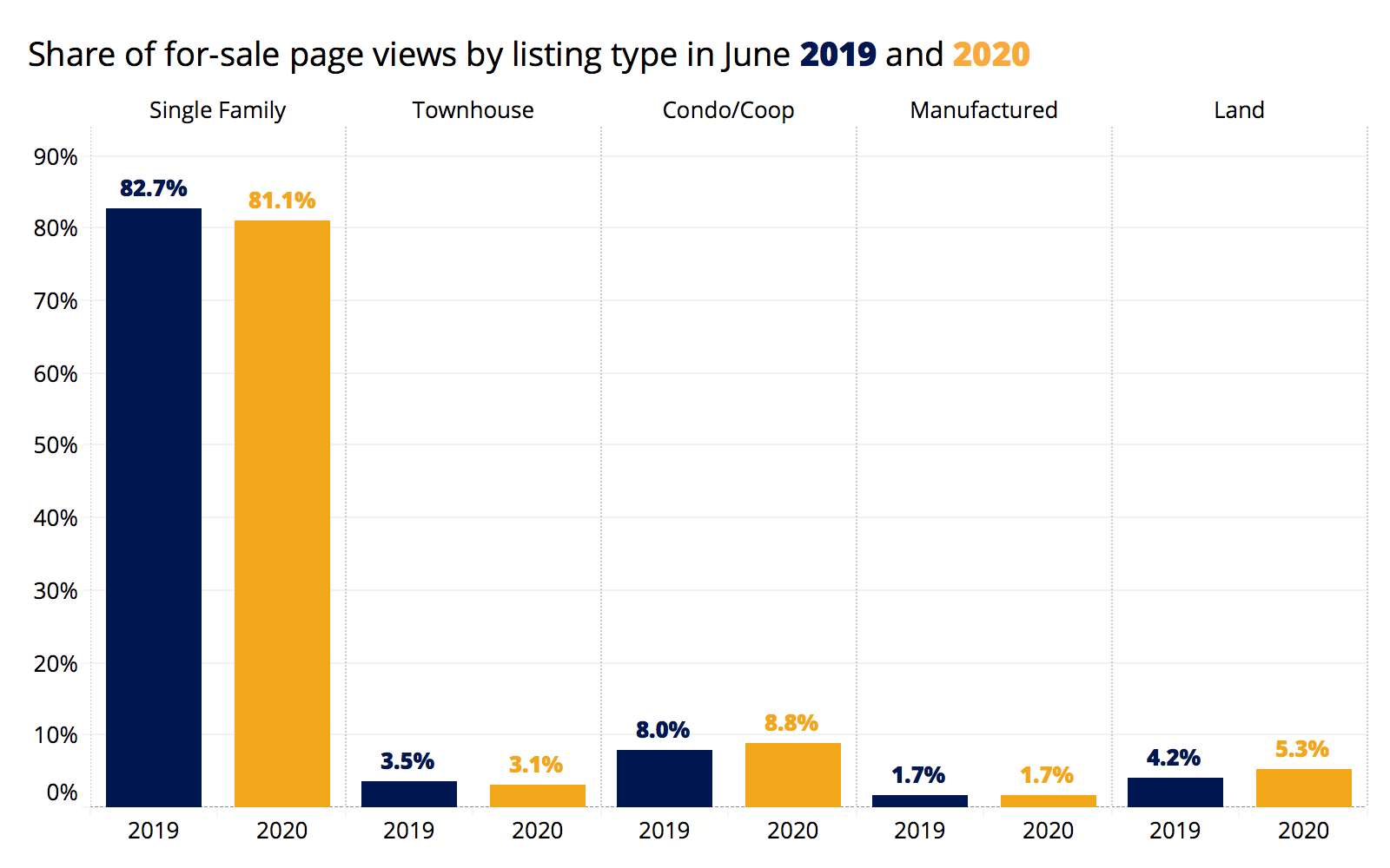
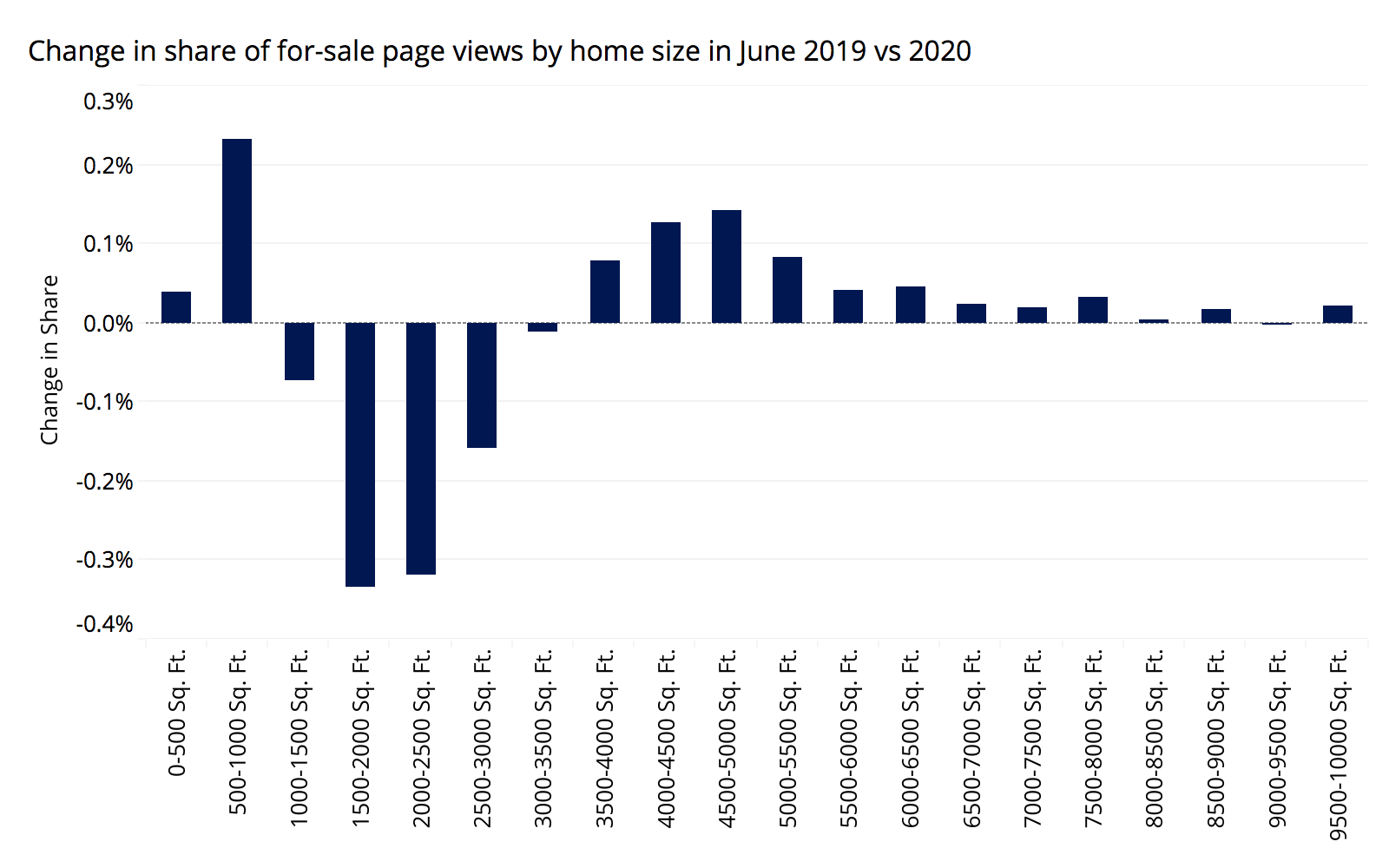
There is no evidence shoppers are eyeing larger homes, often synonymous with the suburbs or rural market, this year relative to last year. Overall, the distribution of listing page views across home sizes is almost indistinguishable from last year.

When bucketing home sizes into 500 square-foot bins, there was minor decline for homes between 1,000 and 3,500 square feet and minor increases for both smaller homes (less than 1,000 square feet) and to a lesser extent larger homes (above 3,500 square feet).
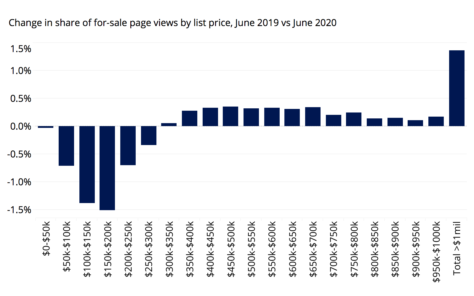
Search for expensive homes is up relative to last year. Especially homes listed for more than $1 million. Homes listed at prices up to $300,000 saw modest declines in their share of total traffic, whereas the share increased slightly for listings between $300,000 to $1 million. All told, the share of views to homes listed for less than $300,000 shrank by 4.7 percentage points this year, while the share of traffic to homes listed between $300,000 and $1 million rose 3.3 percentage points. Traffic to listings above $1 million picked up the other 1.4 percentage points of traffic share. Furthermore, given the extreme diversity of the location of more expensive homes across a market (think suburban Houston vs. urban San Francisco), this provides limited evidence one way or another.
Rental Prices
The typical U.S. urban ZIP code saw a decrease in YoY appreciation of 2% from February to June, while the typical suburban ZIP code fell 1.4%. Before the crisis, YoY appreciation was moving upward, but both urban and suburban rentals have fallen below their pre-crisis trends. However, the relative decline seen in urban ZIP codes larger than that of suburbs.
This trend can be found across the country. Of the 43 major metros analyzed, 24 saw higher rent growth in suburban ZIP codes compared to urban ZIPs.
| Metropolitan Area | YoY Rent Growth – Urban Areas (June 2020) | Slowdown Since Feb. in Urban Areas (Percentage Point Difference) | YoY Rent Growth – Suburban Areas (June 2020) | Slowdown Since Feb. in Suburban Areas (Percentage Point Difference) | Difference in Slowdown Between Urban and Suburban Areas (Percentage Point Difference) |
|---|---|---|---|---|---|
| United States | 1.6% | -2.0% | 2.4% | -1.4% | -0.6% |
| New York, NY | 0.1% | -3.8% | 2.0% | -1.3% | -2.5% |
| Los Angeles-Long Beach-Anaheim, CA | 1.2% | -2.5% | 1.2% | -2.1% | -0.4% |
| Chicago, IL | 1.4% | -1.3% | 1.3% | -1.7% | 0.4% |
| Dallas-Fort Worth, TX | 0.0% | -3.7% | 2.5% | -0.5% | -3.2% |
| Philadelphia, PA | 2.2% | 0.1% | 1.8% | -1.1% | 1.2% |
| Houston, TX | 0.0% | -1.9% | 0.4% | -0.% | -1.0% |
| Washington, DC | -0.1% | -3.0% | 1.0% | -1.8% | -1.3% |
| Miami-Fort Lauderdale, FL | 1.8% | -0.9% | 2.3% | -0.9% | 0.0% |
| Atlanta, GA | -0.5% | -2.0% | 4.2% | 0.0% | -2.0% |
| San Francisco, CA | -2.2% | -3.9% | 0.8% | -1.3% | -2.7% |
| Detroit, MI | 4.4% | 1.4% | 2.0% | -0.8% | 2.2% |
| Riverside, CA | 4.9% | 1.0% | 3.8% | -0.8% | 1.8% |
| Phoenix, AZ | 6.3% | -3.2% | 6.0% | -2.8% | -0.4% |
| Seattle, WA | 1.9% | -4.3% | 2.0% | -3.4% | -1.0% |
| Minneapolis-St Paul, MN | 2.3% | -1.5% | 1.7% | -2.3% | 0.7% |
| San Diego, CA | 2.8% | -1.9% | 1.5% | -2.2% | 0.4% |
| St. Louis, MO | 4.2% | 0.8% | 3.2% | -0.9% | 1.7% |
| Tampa, FL | 2.2% | -2.1% | 3.7% | -0.9% | -1.2% |
| Baltimore, MD | 1.4% | -0.2% | 0.5% | -2.3% | 2.1% |
| Denver, CO | 0.5% | -3.3% | 0.8% | -2.6% | -0.7% |
| Pittsburgh, PA | 1.6% | -3.8% | -1.6% | -2.4% | -1.5% |
| Portland, OR | 2.3% | -1.1% | 2.6% | -1.9% | 0.8% |
| Charlotte, NC | 3.4% | -0.7% | 3.0% | -1.6% | 0.9% |
| Sacramento, CA | 3.5% | -2.7% | 3.8% | 0.3% | -3.0% |
| San Antonio, TX | 1.5% | -2.0% | 1.9% | -1.3% | -0.7% |
| Orlando, FL | 0.4% | -3.6% | 1.5% | -2.4% | -1.2% |
| Cincinnati, OH | 4.2% | -0.8% | 3.0% | -1.% | 1.0% |
| Cleveland, OH | 4.9% | 1.7% | 2.8% | 0.10% | 1.7% |
| Kansas City, MO | 3.7% | 1.2% | 2.5% | -1.% | 2.4% |
| Las Vegas, NV | 2.4% | -3.9% | 2.0% | -3.40% | -0.4% |
| Columbus, OH | 3.8% | 0.2% | 2.9% | 0.1% | 0.1% |
| Indianapolis, IN | 5.4% | -1.0% | 3.6% | -0.7% | -0.3% |
| San Jose, CA | -0.9% | -4.2% | -0.7% | -3.8% | -0.4% |
| Austin, TX | -0.1% | -3.2% | 1.8% | -2.8% | -0.4% |
The metros that saw urban rents shrink the most compared to suburban rents are: Memphis (difference of 3.6 percentage points), Dallas (3.2), Sacramento (3.0), San Francisco (2.7), and New York (2.5). For example, rent growth in urban Memphis ZIPs slowed from 6.3% to 4.8% year over year, a decrease of 1.5 percentage points. Meanwhile its suburban ZIPs went up from 3.4% to 5.4%, an increase of 2 percentage points.
The change in Memphis was particularly notable because the metro saw rents in both suburban and urban ZIP codes increasing before the pandemic. Similarly, Sacramento suburban rents were going down before the crisis, but have turned around, while its urban ZIPs were going up pre-crisis but have since declined.
Some metros have seen the opposite trend (i.e. YoY rents have increased more in the typical urban ZIP than in the typical suburban ZIP since March). Kansas City, Detroit, Baltimore, Riverside and St. Louis saw their typical urban ZIP code's change in YoY appreciation outpace that of suburban ZIPs by 2.4, 2.2, 2.1, 1.8 and 1.7 percentage points, respectively.
Riverside is an interesting counterexample to the narrative of urban-to-suburban flight – while both urban and suburban ZIPs were declining, suburban ZIP codes began to fall more sharply while urban ZIPs actually saw an increase and accelerated beyond their pre-crisis trend.
Definitions and Methodology Notes:
The classification into urban/suburban/rural is done at the ZIP code level published here, and was derived from a nationwide survey done by Trulia where residents were asked if they considered their neighborhood urban, suburban, or rural. Answers were compared to publicly available data on ZIP code characteristics to see what was most predictive of people's responses. Density is the most predictive characteristic but the model does not have bright dividing lines where every ZIP code more or less dense than some threshold gets bucketed a certain way. Nonetheless, broadly speaking, the suburban ZIP codes are those with about 100 to 2,000 occupied homes per square mile; rural ZIPs are mostly less dense and urban ZIPs mostly more dense. The land area for density is taken from the shapes called ZIP Code Tabulation Areas, the widely used approximation for turning ZIP codes into mappable areas.
The post Zillow 2020 Urban-Suburban Market Report appeared first on Zillow Research.
via Zillow 2020 Urban-Suburban Market Report

No comments:
Post a Comment